When creating the apartments in the Maison Rouge club house, we decided to draw inspiration from the concept of the building itself, the architecture of European style. The name – “Red House” – comes from the color of the brick that covers its exterior walls. This color motif became the starting point for organizing the interior, where red and its various shades serve as the main accent color, adding character to the space. Thus, the architecture of the building became a kind of “tone of voice” for its interior solutions.
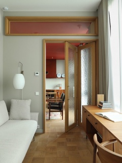
The layout of the apartments includes a living area combined with a kitchen, a study, a bedroom and a bathroom. Despite the compact size, every square meter was meticulously planned and used efficiently. Openings, sliding semi-transparent doors and sash windows visually expand the space and create a smooth transition between different areas.
Our team loves working with color and actively incorporates it into the interior. Red, by its nature, is ambiguous, sometimes too intense, but when approached correctly, it creates a feeling of warmth and coziness. Supporting our bold decision to introduce an active color into the interior, the client agreed to apply it to the ceiling, raising the color accent upwards, above eye level. This technique allowed us to give the interior a warm glow without overloading it. We used wooden elements to calm the intensity of the chosen color: a wide wooden cornice blurs the rigid boundaries between the red ceiling and the light wall, creating a smooth transition.
The wooden floor is also a key design element. Engaging with the vibrant ceiling, its lively texture and clear geometry balance the red color. The chessboard pattern is created by turning the wood grain. Large-scale chessboards – 40×40 cm – shape the perception of the living room, making it more open and spacious. In the bedroom and study, where space is limited, we used the same chessboard pattern idea but reduced the size of the cell by half, visually enlarging the space in these rooms. This technique allows playing with scale, making smaller rooms appear more spacious.
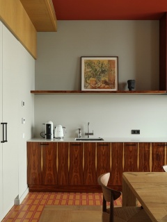
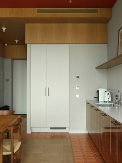
The tile at the entrance to the kitchen is adorned with a bright red-orange geometric pattern. It echoes the floor geometry, acting as a kind of “rug” that zones the entrance area and kitchen. The kitchen with rosewood facades is inspired by the aesthetics of the 60s. The rich reddish hue of this wood creates a connection between the floor, walls, and ceiling, while the light natural pattern of the rosewood “candles” adds a lively organic rhythm that echoes the clear pattern of the floor. The geometric metal ventilation hood descends smoothly from the ceiling, resembling a sculptural object.
The dining area, combined with the living space, combines simplicity and elegance. The main element here is a large oak dining table, simple yet refined in shape. Elegant dining chairs with fluid legs and smoothly curved backs create an interesting contrast with the calm design of the table. For lighting the dining area, we used an unusual fixture resembling an open book in shape. It perfectly complements the elongated line of the table and, like the chairs, adds a stylish and unconventional solution to the space for cozy gatherings.
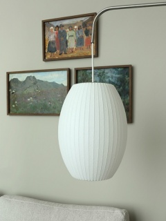
The living room is organized around a sofa group inspired by Scandinavian aesthetics. It includes an elegant light gray sofa, which softly blends with the tonal palette of the walls, two vintage armchairs, and a long coffee table in contrasting black. The chandelier in the living room brings all the elements together: elegant strictness, the curvature of vintage lines, geometry, and modern design.
For the study, we selected a comfortable daybed, perfect for reading books and relaxing on weekends. The cushions on the daybed can be easily removed, turning it into a bed, which allows hosting guests. One of the important tasks was to conveniently place the client’s library. For this purpose, we designed a wooden bookcase that complements the long work surface of the desk. It is worth noting that almost all the furniture in the project is unique, as it was manufactured according to our design.
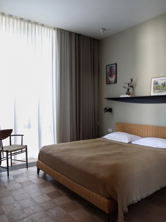
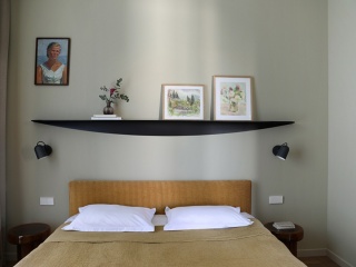
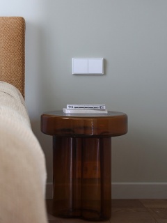
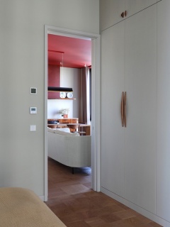
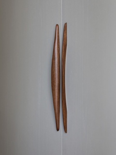
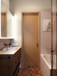
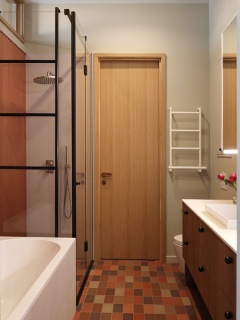
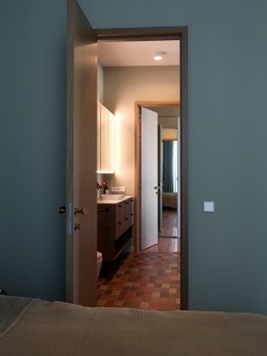
The bedroom space is more intimate and secluded. The warm mustard shade of the bedhead and the glass bedside tables create a cozy atmosphere. Above the bed is a shelf from Vera Odyn’s “Forest” collection, where paintings and decorative items can be placed. The wardrobe with smooth sculptural wooden handles was also designed according to the bureau’s sketches. In the bathroom, we continued the idea of implementing the red color but in a softer and more relaxed version, using terracotta and earthy tones. These colors provide a sense of connection to nature and touch to natural elements. The sash window, along with reflective surfaces of mirrors, let in natural light and add airiness. For efficient use of space, we suggested the idea of a double entrance to the bathroom, both through the bedroom and the living room. Internal doors allow closing the room from the inside.
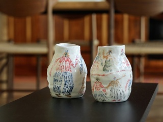
The light tone of the walls visually enlarges the space and serves as a backdrop for the exhibition, highlighting the client’s love for modern art. The collection brings together works by completely different authors – from paintings to poster art – and is organized both using classic wall hanging and free placement on shelves, giving the space a more casual character.
The interior of Maison Rouge combines features of contemporary European design and the style of the 60s: mid-century with its simplified geometry, natural materials, functionality and a modern approach embodied in the desire to experiment with various elements of style and design. Here, the boundary between architecture, design, and art becomes blurred, and each object gains individuality, representing a work of art.
Status: Implementation
Location: Moscow
Area: 70 m2
Year: 2023
Photos: Ekaterina Kozhevnikova
-
The name - "Red House" - comes from the color of the brick that covers its exterior walls. This color motif became the starting point for organizing the interior
-

-

-

-

-

-
-
The layout of the apartments includes a living area combined with a kitchen, a study, a bedroom and a bathroom. Despite the compact size, every square meter was used efficiently
-

-

-
-

-

-

-
-
Our team loves working with color and actively incorporates it into the interior. Red, by its nature, is ambiguous, sometimes too intense, but when approached correctly, it creates a feeling of warmth and coziness
-

-

-
-
-
-
The bedroom space is more intimate and secluded. The warm mustard shade of the bedhead and the glass bedside tables create a cozy atmosphere. Above the bed is a shelf from Vera Odyn's "Forest" collection
-
-
-
-
-
-
In the bathroom, we continued the idea of implementing the red color but in a softer and more relaxed version, using terracotta and earthy tones
-
-

-
-
-

-


